/5340d51e-bce8-4d81-8135-114bfb4e2f5c.png "effective pareto charts by category Main Image")
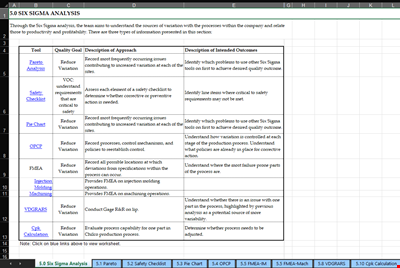
Effective Pareto Charts by Category
Review Rating Score
Do you need to quickly and easily visualize the most significant issues within your data? A Pareto Chart is the answer! It's an essential tool for quality control and performance improvement, and we've got you covered. At BizzLibrary.com, we offer a comprehensive Pareto Chart template that can help you to efficiently sort and analyze your data.
What is a Pareto Chart?
A Pareto Chart is a graphical representation of data that shows the most significant factors contributing to a specific problem or scenario. The chart displays both the relative frequency and cumulative impact of each factor on a horizontal and vertical axis, respectively, allowing you to quickly identify the most critical issues. The Pareto Chart is named after Vilfredo Pareto, who observed that 80% of the wealth in a society typically belongs to 20% of the population.
Why Use a Pareto Chart?
The Pareto Chart is an effective tool for analyzing data and identifying the factors that account for the most significant problems in a process. Here are some benefits of using a Pareto Chart:
- Sort by Category: The chart sorts the data by category, prioritizing the issues with the highest occurrence, making it easier to focus resources on resolving or improving issues that are critical to the process.
- Address Defects Efficiently: By identifying and addressing the issues with the highest incidence, the Pareto Chart helps organizations to resolve the most prevalent defects quickly and efficiently, resulting in improved performance.
- Visualize Results: The chart provides a quick and easy-to-understand visual representation of complex data sets, making it easy for anyone to identify the issues quickly and collaborate on improvements.
How to Use Our Pareto Chart Template
At BizzLibrary.com, we offer a user-friendly Pareto Chart template that enables you to sort your data in descending order by category, frequency, and the percentage contributing to the total. Here's how to use our Pareto Chart template:
- Download our Pareto Chart template in XLSX format from our website.
- Input your data into the spreadsheet, including the categories, the number of occurrences, and the percentage representing each category.
- The chart will automatically generate based on your data, allowing you to download and save the template for future use.
Download Your Pareto Chart Template Today
If you want to take advantage of the benefits that come with using a Pareto Chart, don't hesitate to download our easy-to-use template in XLSX format. At BizzLibrary.com, we offer a wide range of business document templates, including Pareto Chart templates and more. Visit our website now and start improving your performance!
Take advantage of our expertise and resources today and see the benefits of our templates firsthand!
Is the template content above helpful?
Thanks for letting us know!
Reviews
Shawanna Torres(6/25/2023) - GBR
Grateful!!
Last modified
Our Latest Blog
- A Guide to Make a Business Plan That Really Works
- The Importance of Vehicle Inspections in Rent-to-Own Car Agreements
- Setting Up Your E-mail Marketing for Your Business: The Blueprint to Skyrocketing Engagement and Sales
- The Power of Document Templates: Enhancing Efficiency and Streamlining Workflows
Template Tags
Need help?
We are standing by to assist you. Please keep in mind we are not licensed attorneys and cannot address any legal related questions.
-
Chat
Online - Email
Send a message
You May Also Like
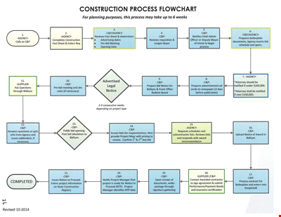
Create Professional Project Flow Charts with our Free Template
Social Event Flow Chart Template - Plan, Organize, and Execute Memorable Events
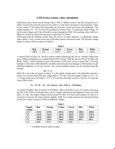
Calculation Resistor Value Chart For Led

Reward Template for Kids | Printable Behavior Chart & Chore Chart

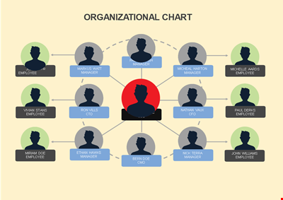
Organizational Chart Template, Editable Org Chart, Free Download

Minecraft Birthday Banner - Buy Customizable Party Decorations
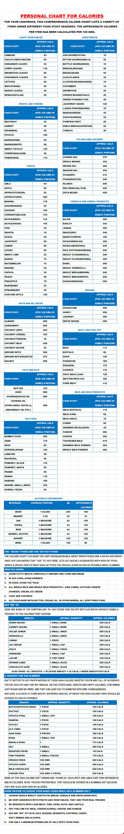
Personal Food Calorie Chart
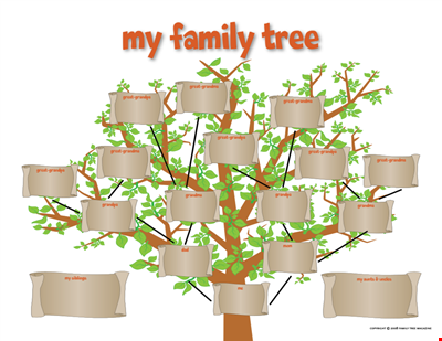
Family Tree Chart For Kids
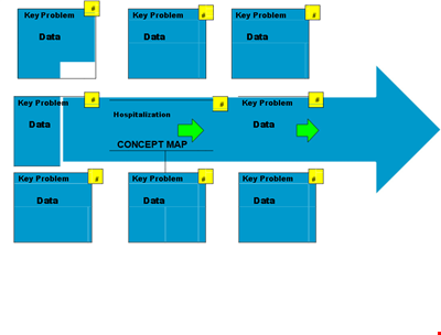
Create Organized Concepts with Our Concept Map Template - Solve Problems & Analyze Reasons
Find the Ideal Pulse Rate with Our Chord Tool
Org Chart Template Word
Understand and Reduce Process Variation with a Pareto Chart
Create an Organizational Chart Template - Easily Visualize Your Company Hierarchy

Free Vintage Family Tree Template
Large Hospital Organizational Chart Template - Download Now
Printable Shoe Size Chart for Kids: Find the Perfect Fit for Your Little Ones